Assessing Podcasts Take Too Much Effort
My user interviews revealed listeners spend a lot of effort to assess new podcasts but are unsuccessful in finding a new show to follow. The podcast discovery experience suffers from two key issues that make it hard to sift through new podcasts.
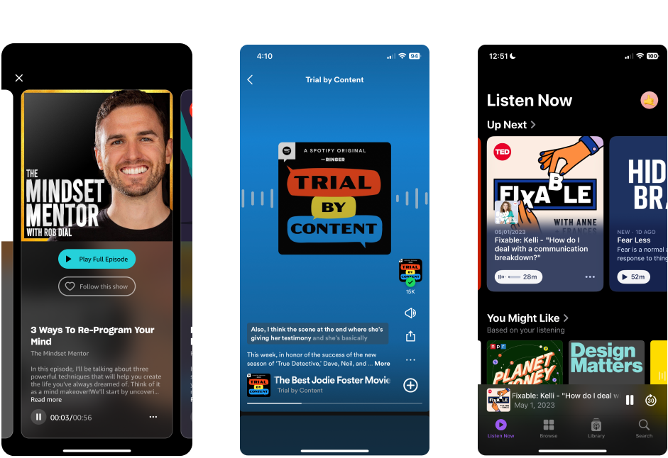
Assessing Tone is Hard
Recommendation algorithms don't match tone preferences well. Listeners were disappointed when recommendations were too casual or too formal and are frustrated that they only realized after they started listening to the podcast.
Only Snippets and Transcripts
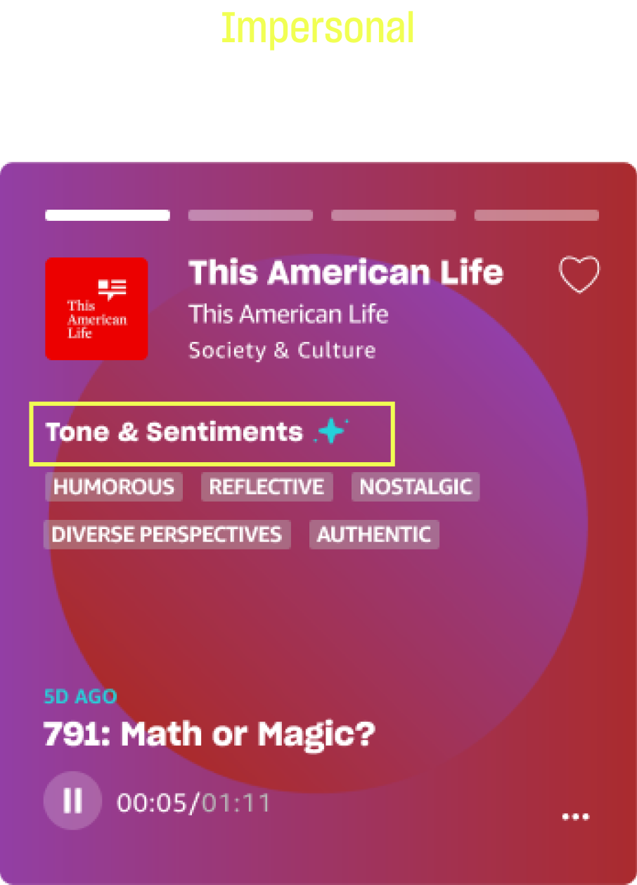
Tone is conveyed on streaming platforms through listening to a snippet or reading a transcript, both of which are time-consuming.
Express Tone through Keywords and Visuals
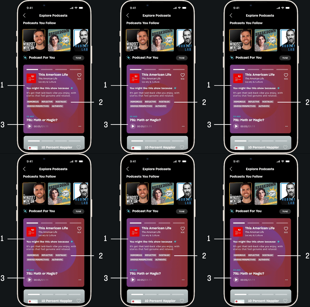
Key Info is Missing
Tone, content, and reviews are 3 key factors listeners use to assess new podcasts that needs to be improved. I learned users also want to know why the podcast is being recommended during card sorting to priortize factors.
AI Extracts Pertinent Information
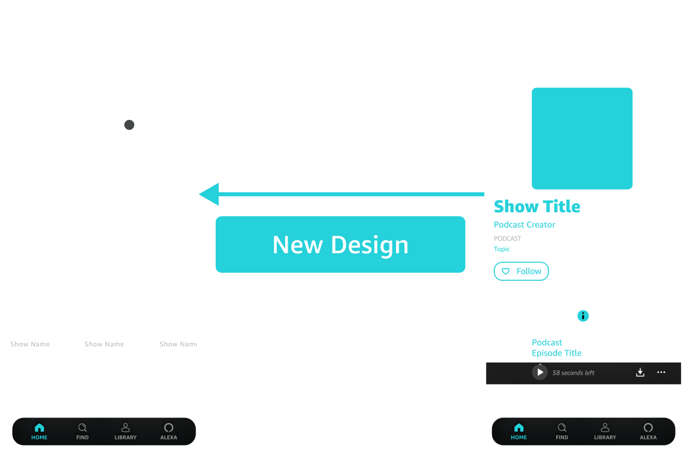
The current flow requires users to click into podcast shows to access show information. The new design brings relevant and personalized AI-generated podcast information out from the podcast show page into the explore page.
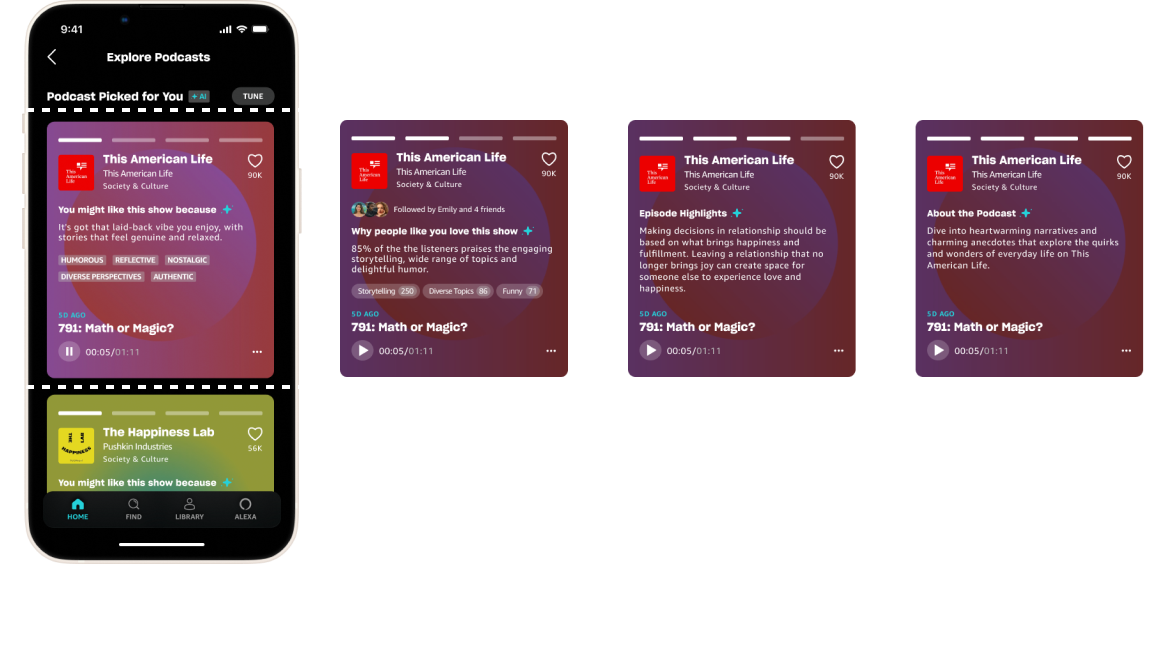
A Card Carousel Accommodates Relevant Information
A carousel allows users to access more information quickly if they're interested and skip past podcasts if they're not. I used paper prototype testing to arrive at the final card layout.
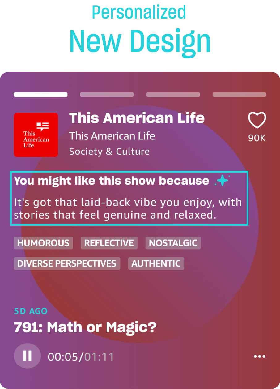
Ramp Up the Personalization
Users wanted clear indicators AI is personalizing content to their preferences.
Presenting Podcast Picks
Creators Deserve a Say in Podcast Picks
In the challenge, our scope was limited to the listener's experience. Given more time, Meng and I would have explored how creators would respond to AI representing them. We would explore creator tools to review and refine AI-generated descriptions.
Lessons in Moving Foward
With only 4 weeks to complete the design challenge from prompt to presentation, we outlined each phase of the project. Inevitably, our design process wasn't linear but we were always able to move forward with each conversation.
