Challenge
Make the Interface Idiot Proof to Reduce Mental Load
Cansera is creating a novel measurement system that requires medical staff to learn a new protocol, measurement, hardware, and software. Lowering the barrier to using the tool makes implementation smoother for study coordinators and physicians.
Usability test overview
Designs are Straightforward, Could Guide Users More
I conducted remote moderated user tests on wireframes designed by Luciano and identified 3 opportunties for improvement:
Make Patient Search First
25% of participants misclicked from the home page because they navigated to the patient page first.
Match Industry Standards
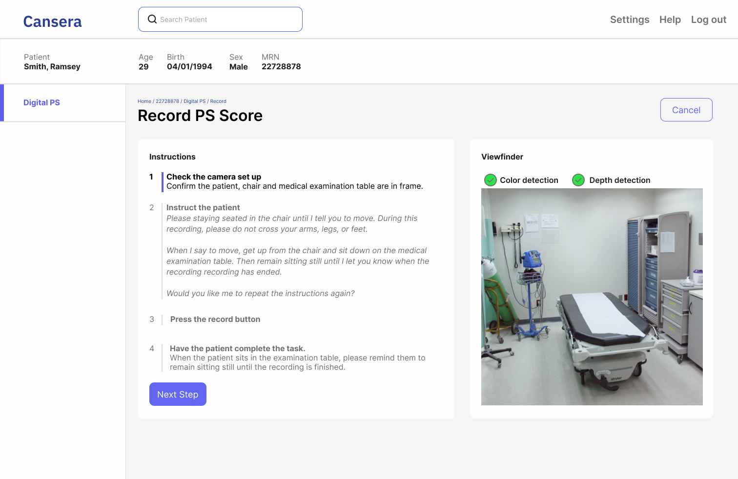
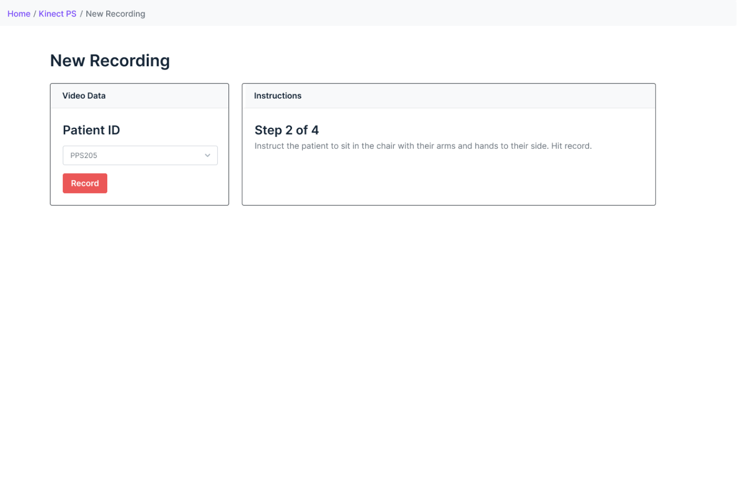
To reduce confusion and misclicks, we changed the task order and navigation for recording a task to better match the user's expectations of searching patient's first.
Show Image Feeds and Videos
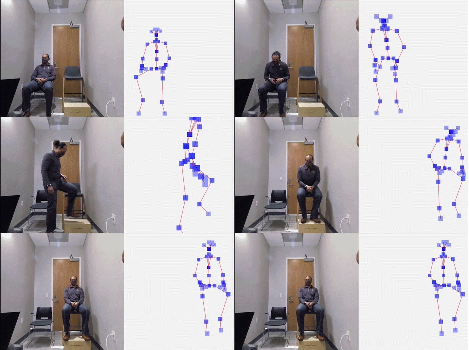
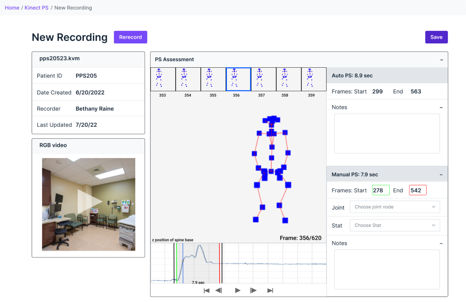
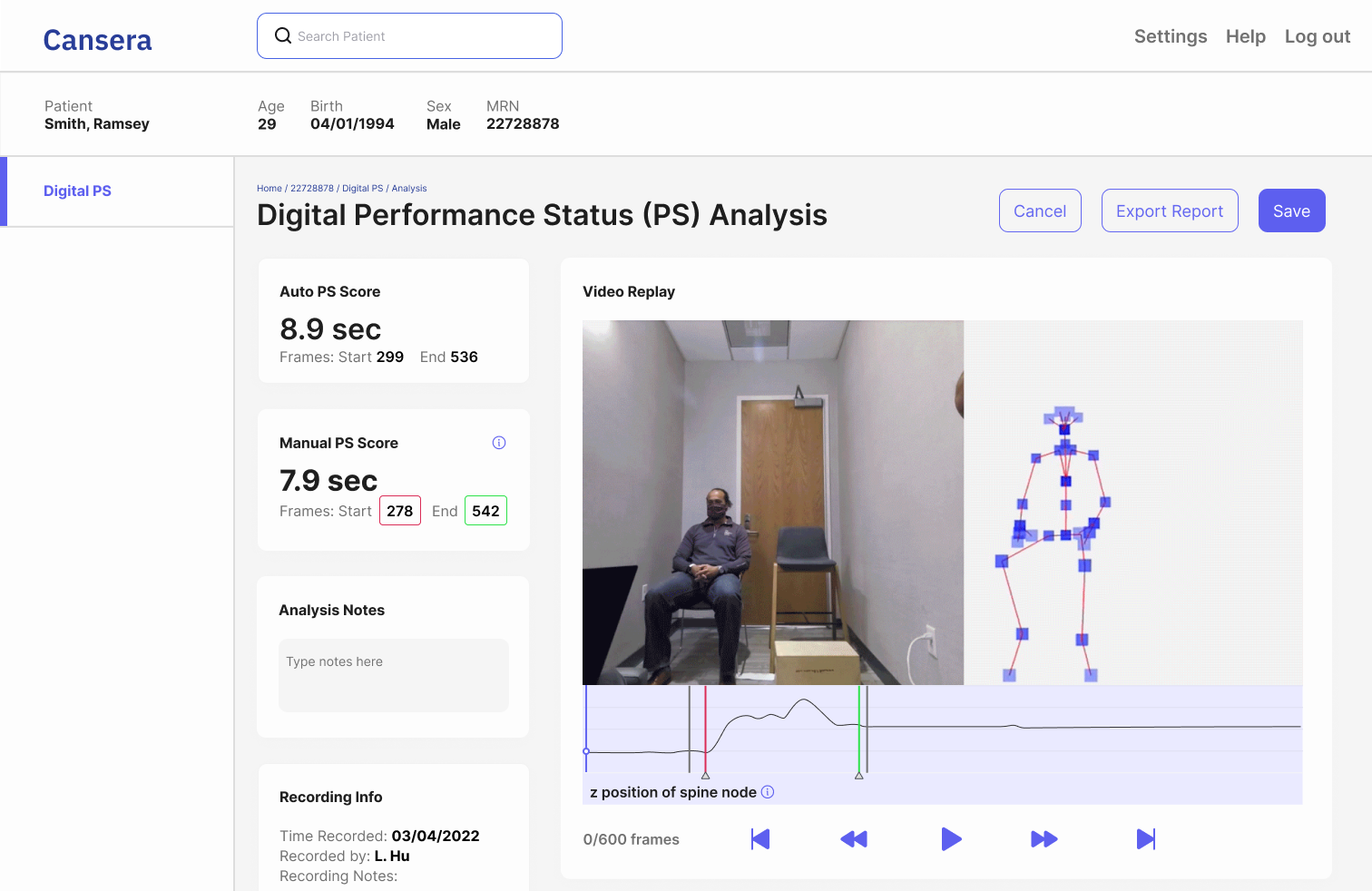
3D motion capture cameras aren't a tool regularly used in healthcare; the 3D video output (below right) is unfamiliar, making it difficult to interpret. Help users build their understanding of the 3D measurement feed by showing the normal video.
A Viewfinder Helps Orient Users
Rather than having to wait for the video to process and upload for quality control, giving access to the viewfinder gives immediate feedback and control.
Side by Side Image Video Helps Users' Learn
Putting the image video adjacent to the 3D video helps users understand what they are watching.
Improvement #3
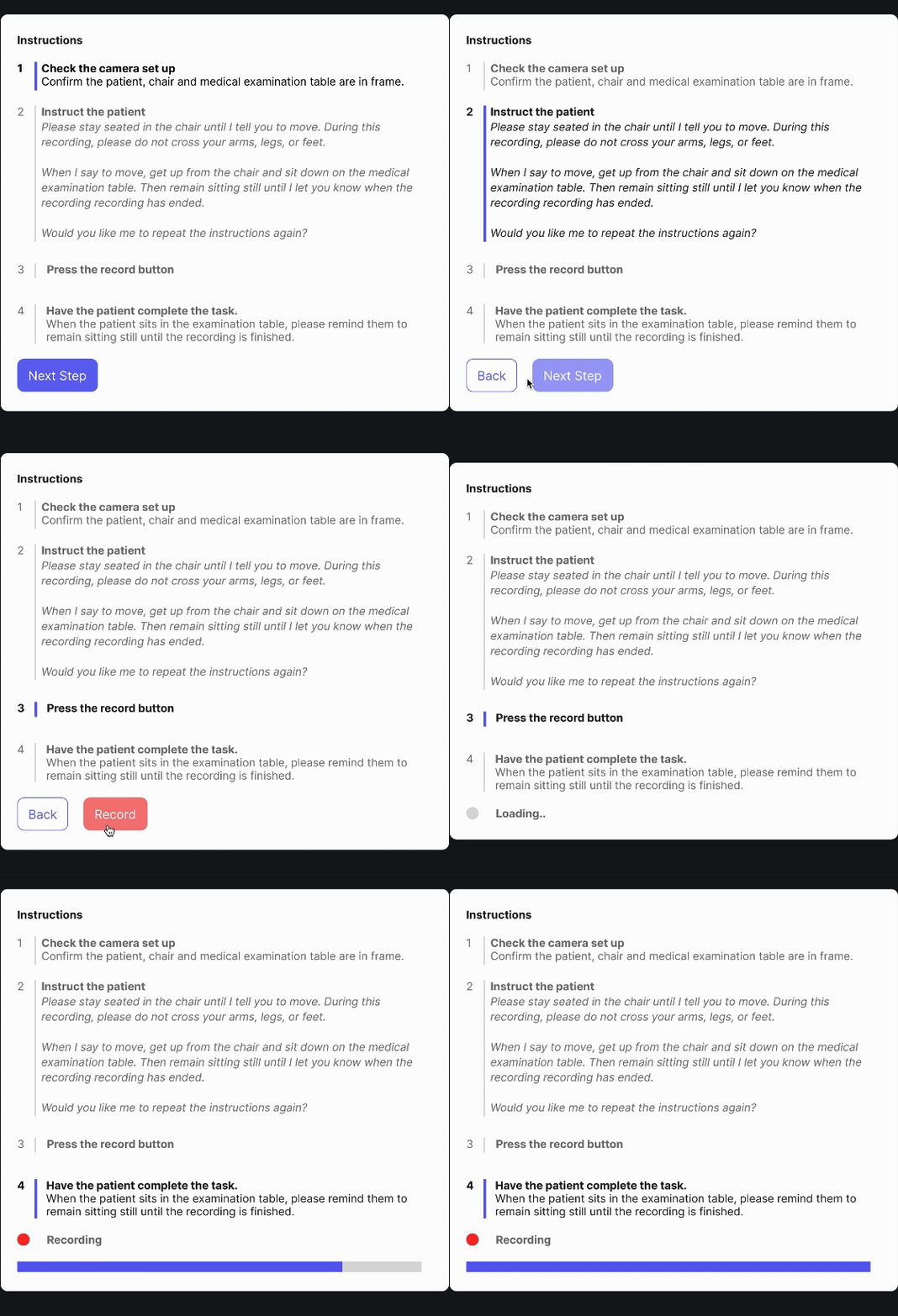
Show Instructions Before Recording
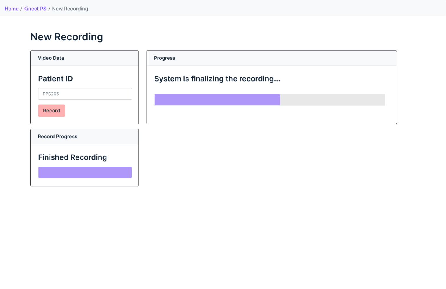
Recording a measurement successfully requires specific timing. In the old wireframes, the instructions popped up with the correct timing but confused users.
Use Color and Contrast to Indicate Timing
The new design shows alls instructions and uses a progress bar to indicate timing of steps.
A Positive Reception, $2M Investment from the National Cancer Institute
After I presented the designs, the National Cancer Institute awarded Cansera with $2 millions in funding to develop the dashboard.

